Creative Director & Brand Strategist
Light
tells every
story.
Crafting images that breathe, where editorial precision meets the raw texture of the world.
Scroll
Creative Director & Brand Strategist
Crafting images that breathe, where editorial precision meets the raw texture of the world.
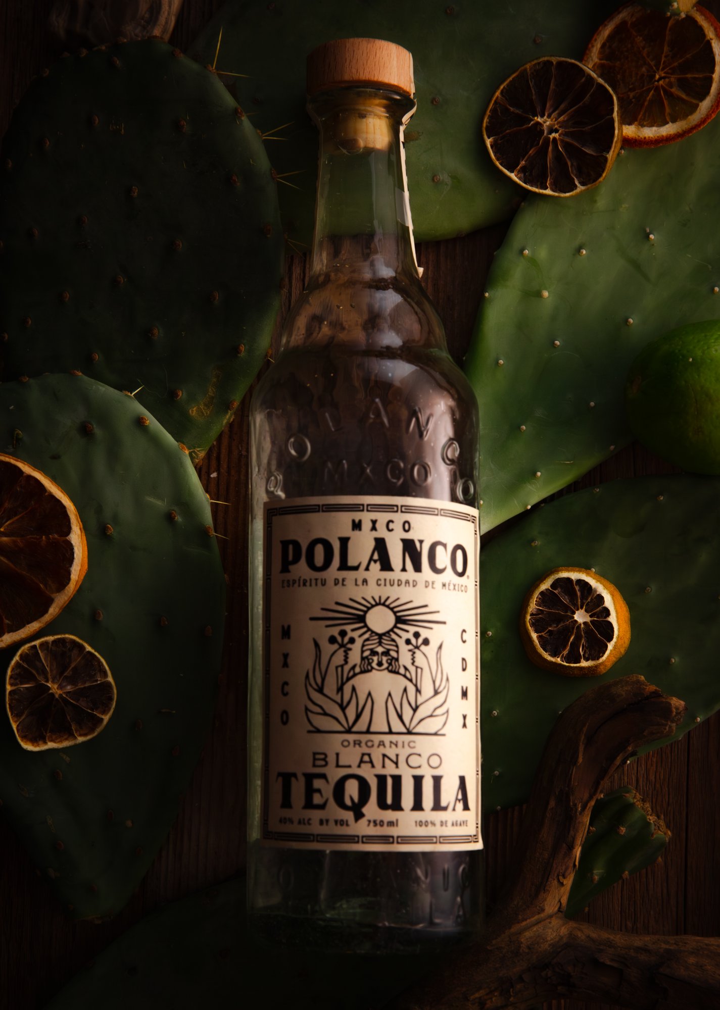
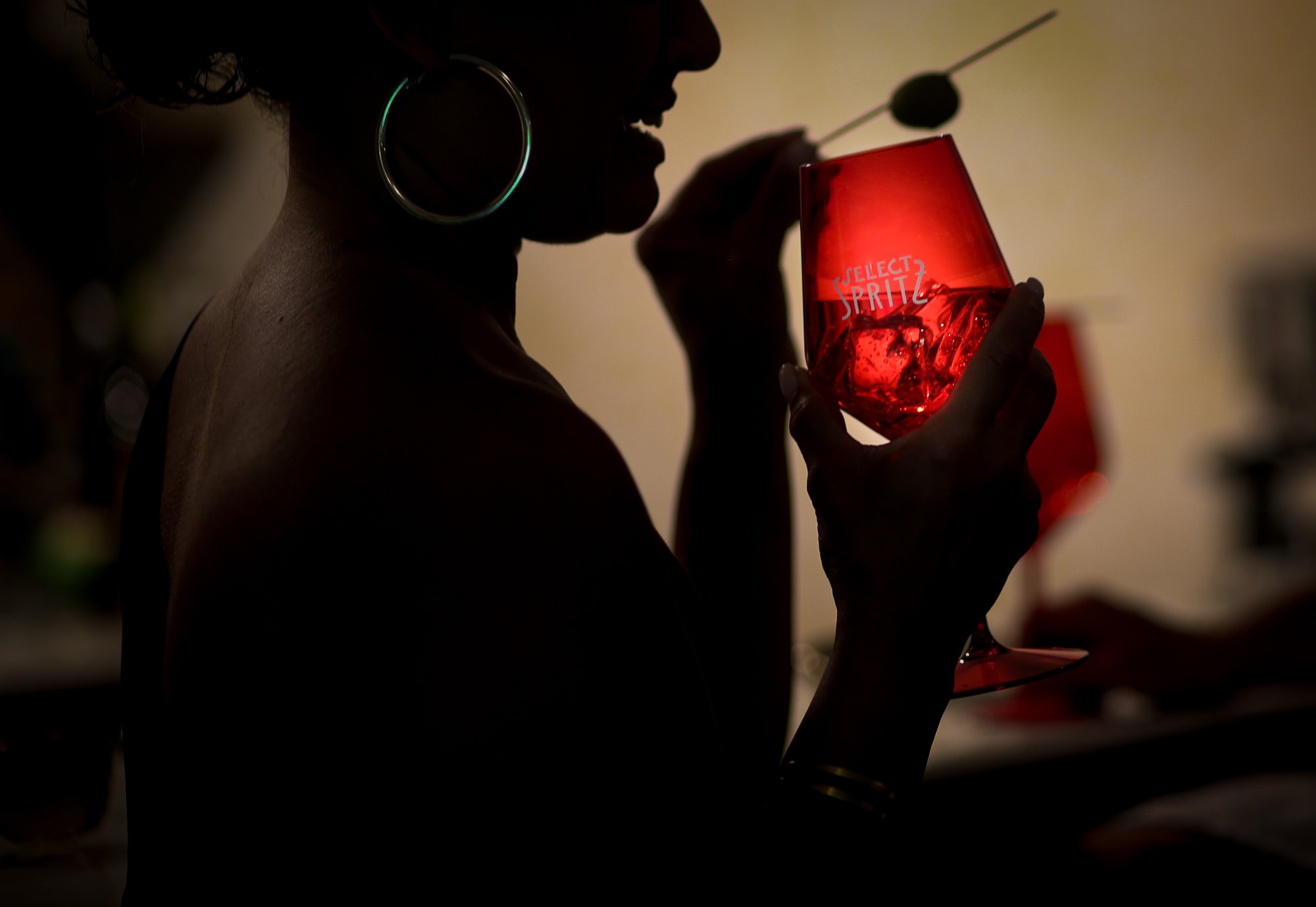

Brand Direction · Distillery
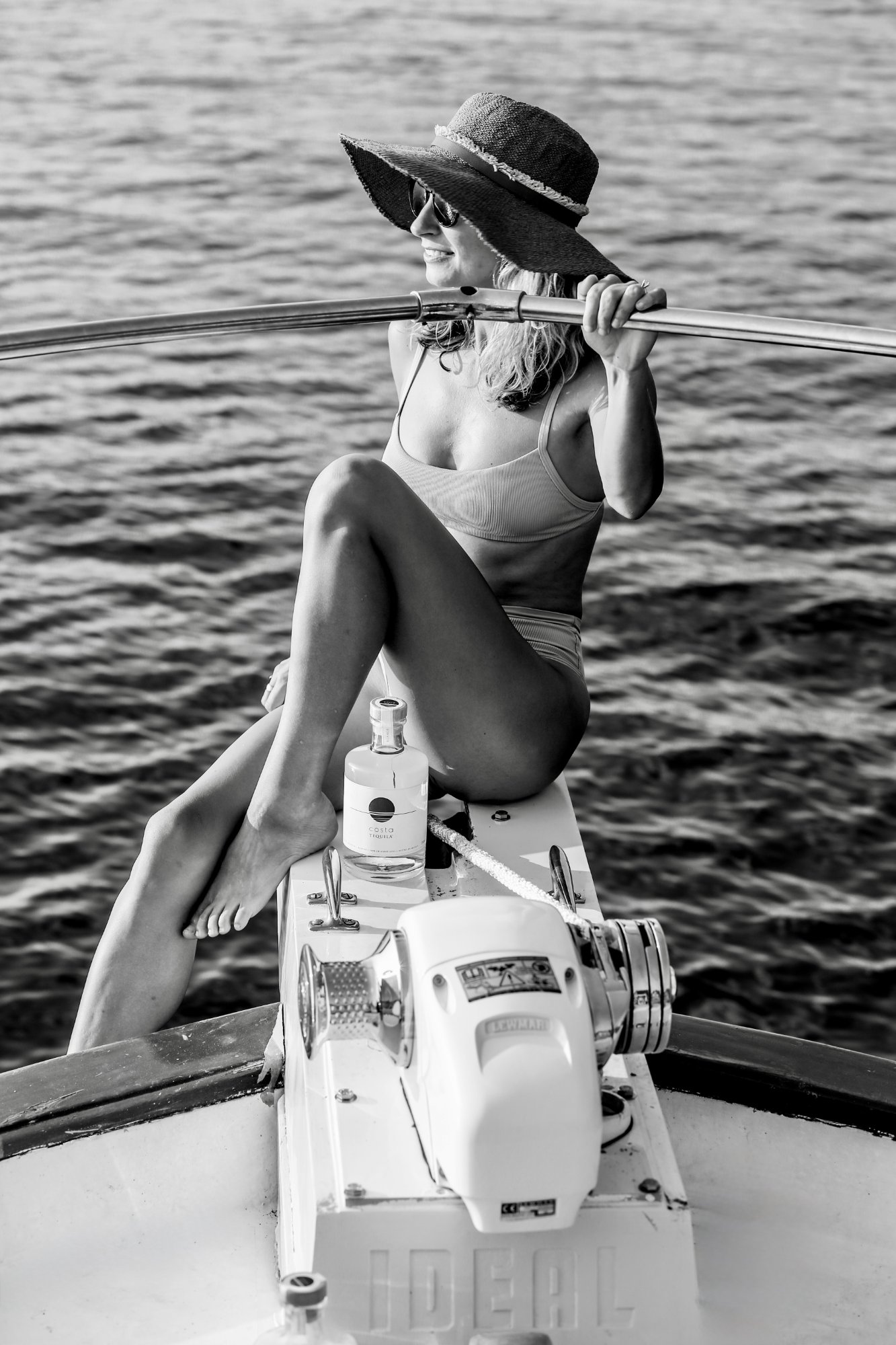
Full Brand Identity · Tennessee
Viral Campaign · National Retail
About
I'm a creative director and brand strategist working at the intersection of visual identity, content strategy, and moving image.
My approach is built on patience, finding the quality of light, the held breath before an expression resolves, the geometry of an ordinary brand transformed.
Full-scale brand identity and strategy systems — from positioning and voice to visual identity and launch campaigns.
Art direction and campaign leadership across photography, content, and digital — coordinating every touchpoint into a unified vision.
Editorial and social content systems built for brands that need coherence, consistency, and creative impact at scale.
Available for commissions, collaborations, and creative partnerships. Response within 48 hours.
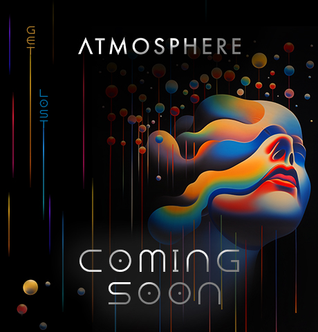
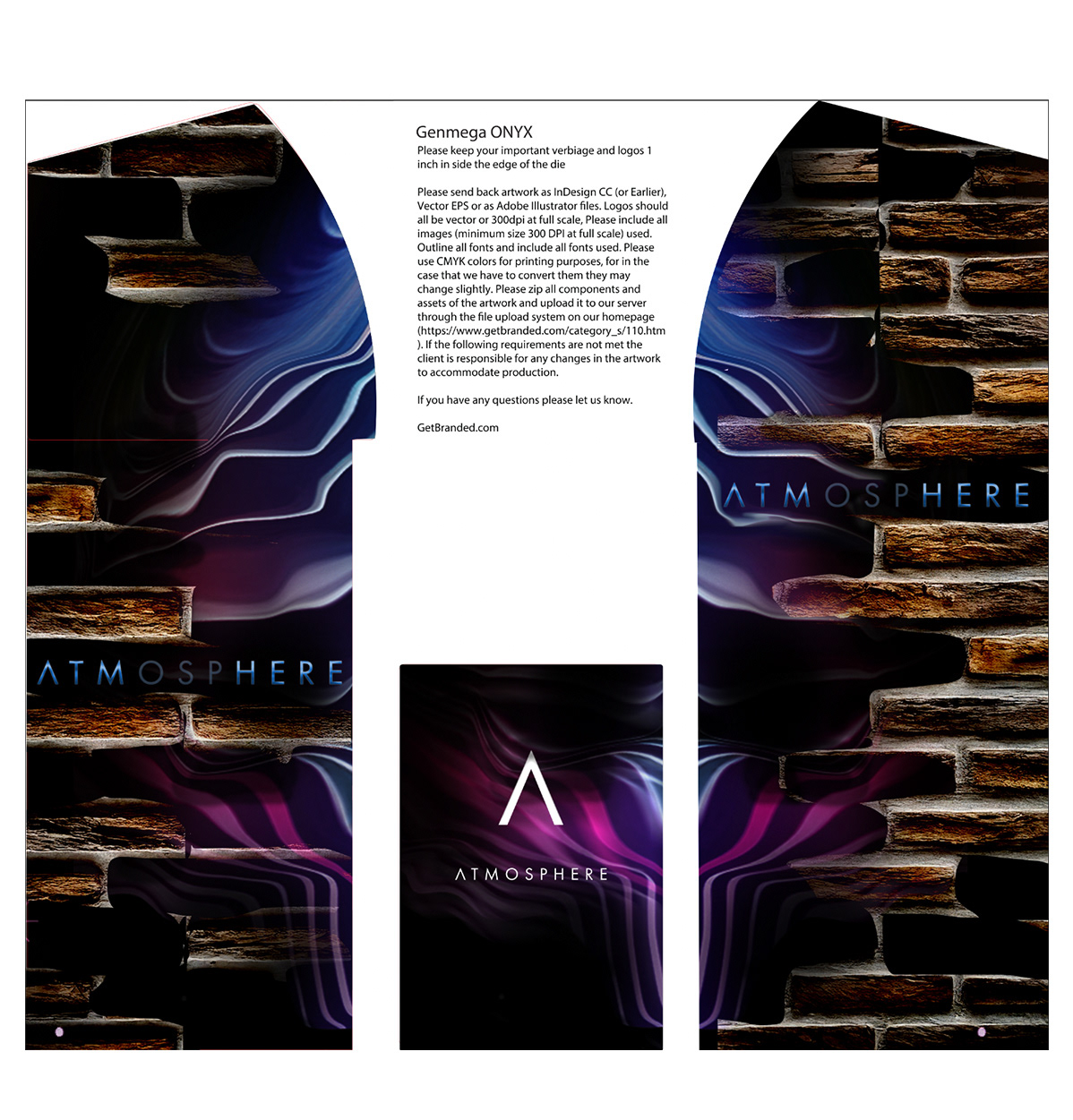
Full Brand Identity · Tennessee · Launched June 2025
Creative Director · Brand Strategist · Storyteller
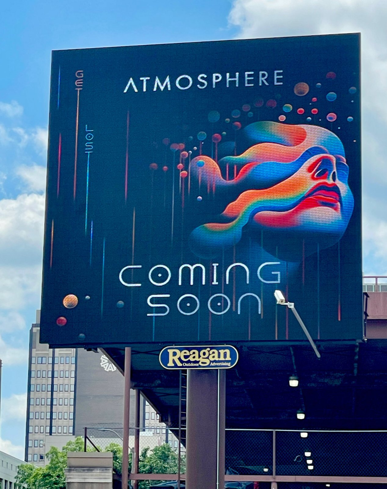
The Concept
Atmosphere was born from a desire to create a space where people could transcend the mundane and embrace the extraordinary — a place that feels as limitless as the sky and as grounding as the Earth.
Its name reflects the layered experiences it offers, just like the atmospheric layers that envelop our planet. Each level of the venue embodies one of these layers — a speakeasy coffee shop where every floor is a different world, inviting patrons to explore, connect, and create.
The Creative Leap
The atmosphere above us exists in distinct layers — troposphere, stratosphere, mesosphere — each with its own pressure, temperature, and character. That scientific reality became the entire creative framework for the venue. Each floor was mapped to a layer, each layer assigned a mood, a palette, an experience. The brand didn't borrow the metaphor loosely. It built itself around it with precision.
The visual language followed directly from that structure. The surreal, layered imagery in every asset — the fluid forms, the atmospheric depth, the sense of something dissolving between worlds — was a direct translation of what the sky actually looks like when you study it. Art rooted in science. Identity rooted in nature.
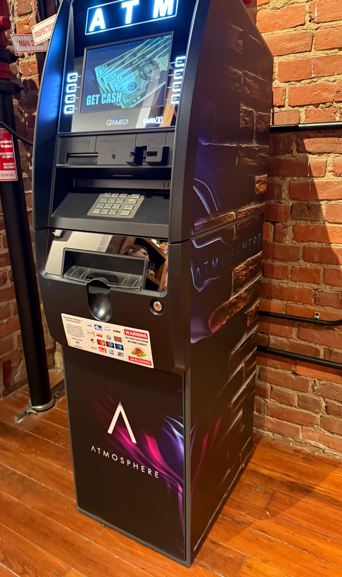
As the connective tissue between an abstract idea and its full physical execution, the work was to make something that felt as inevitable as weather — not designed, but discovered. Every touchpoint, from the billboard to the branded ATM to the packaging, carried the same layered logic. Nothing existed outside the story.
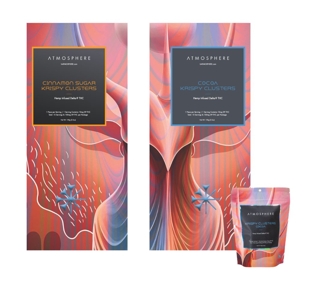
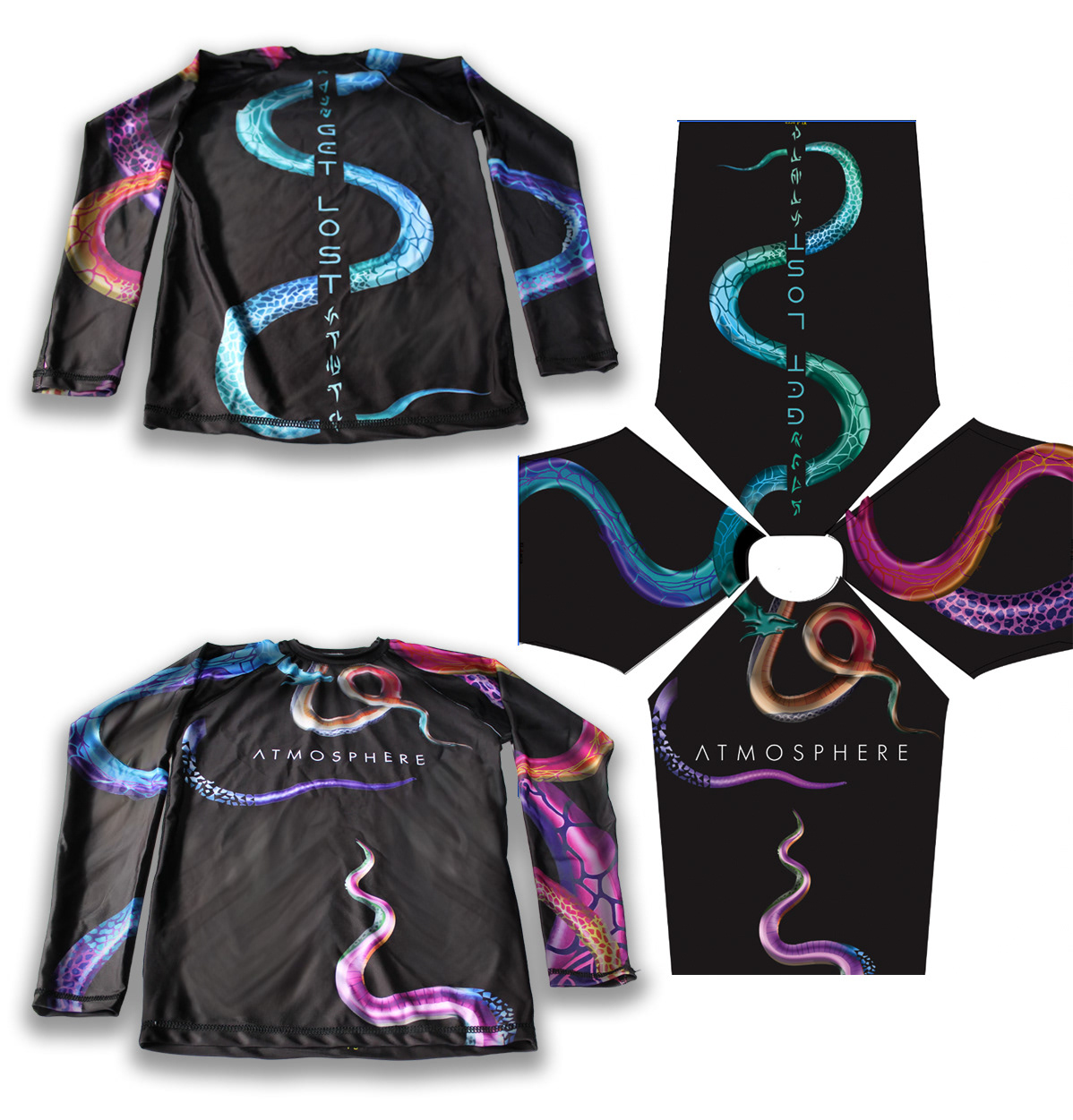
The Work
Brand story, visual identity system, product packaging, merchandise and apparel design, ATM wrap, outdoor billboard campaign, and full social content strategy — built to create intrigue before the doors ever opened and sustain the world once they did.
Viral Social Impact Campaign · Launched January 2015
Creator · Creative Director · IP Owner
The Problem
The conversation around mental health and addiction was drawing hard lines where there weren't any. The prevailing narrative required a label — addict, recovering, diagnosed — before your pain was considered valid.
But the reality was messier and more human than that. Mental illness didn't always end in addiction. Addiction didn't always begin with a choice. And the journey to heal — wherever you were in it — was hard for everyone. That gap in the conversation was the brief.
The Origin
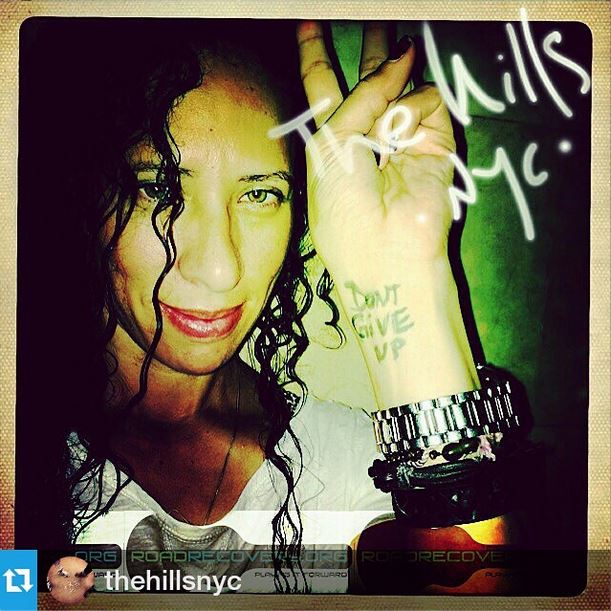
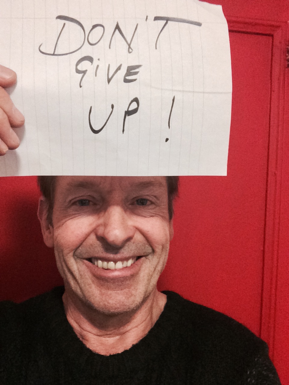
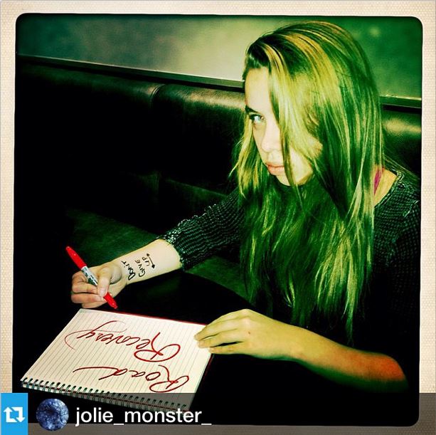
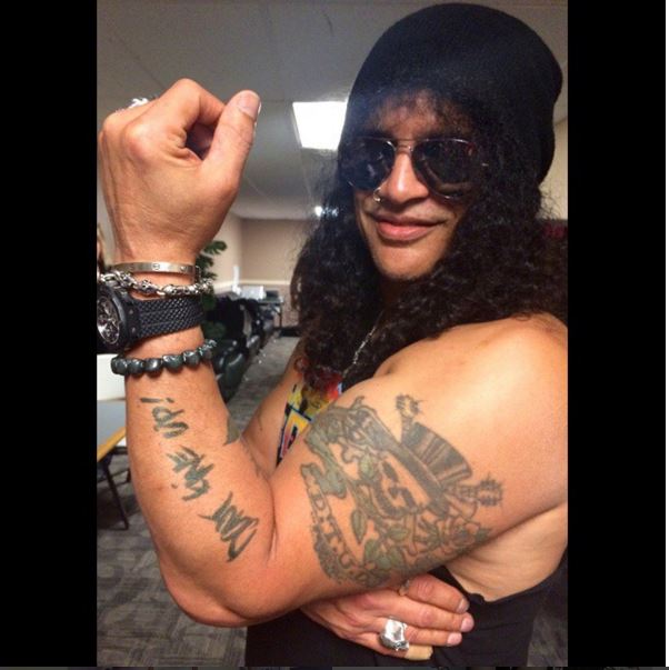
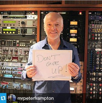
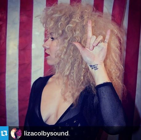
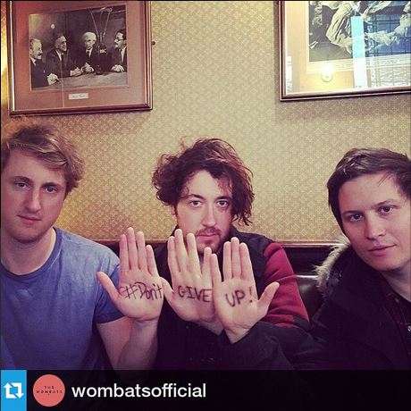
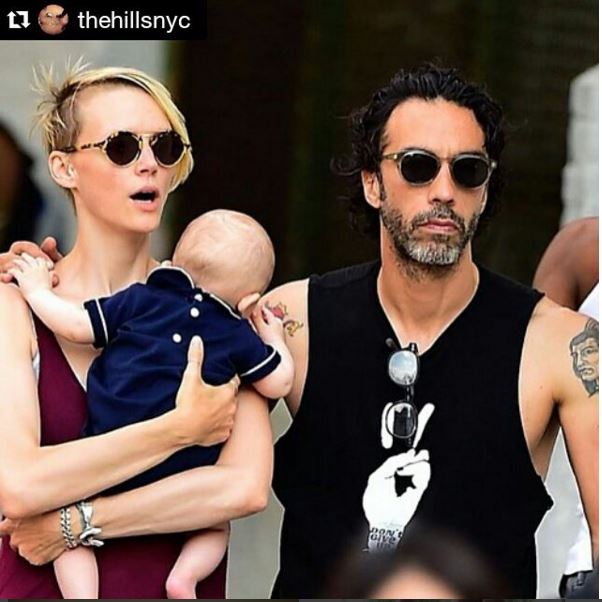
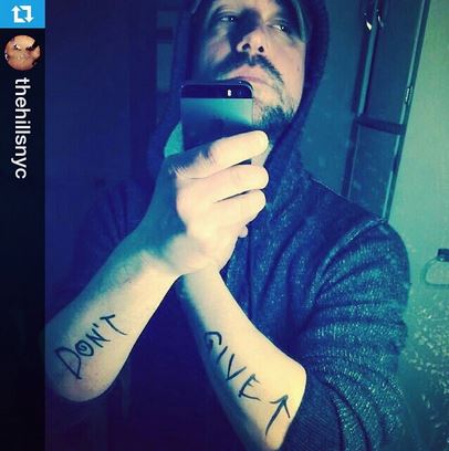
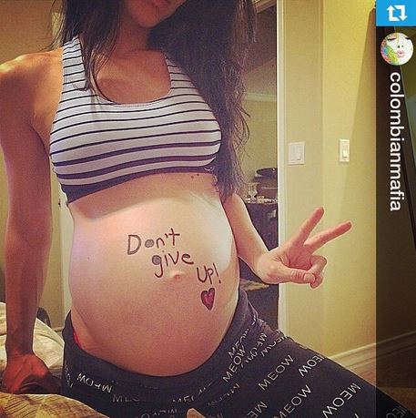
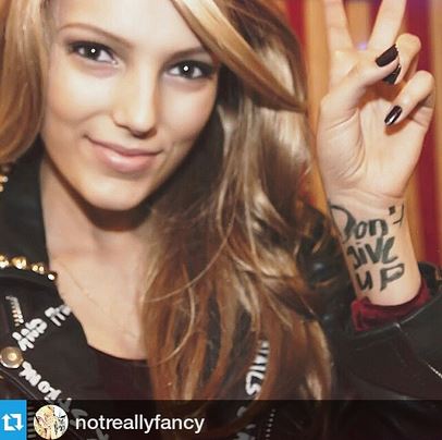
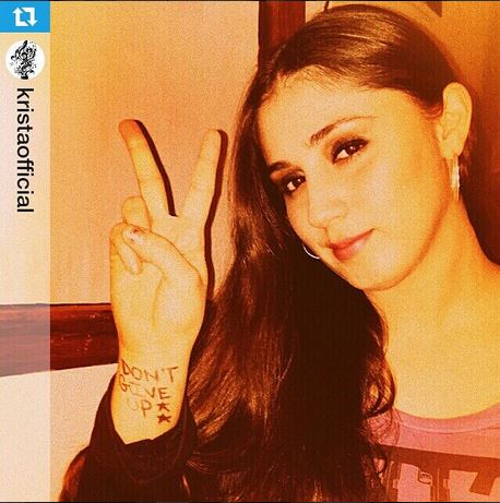
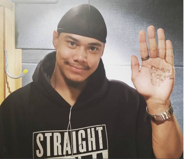
The #dontgiveup movement launched with a single act — a selfie with the words "Don't Give Up" written in Sharpie on a hand. No agency, no budget, no media plan. Just a belief that the world needed to bond around a simpler truth: wherever you are in your process, don't give up on yourself, your loved ones, or your healing.
The response was immediate and organic. People recognized themselves in it — not because they fit a category, but because the message asked nothing of them except to keep going.
The Movement
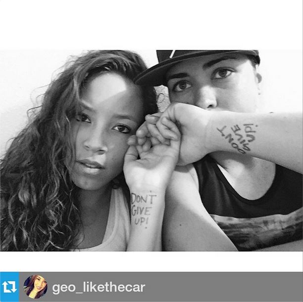
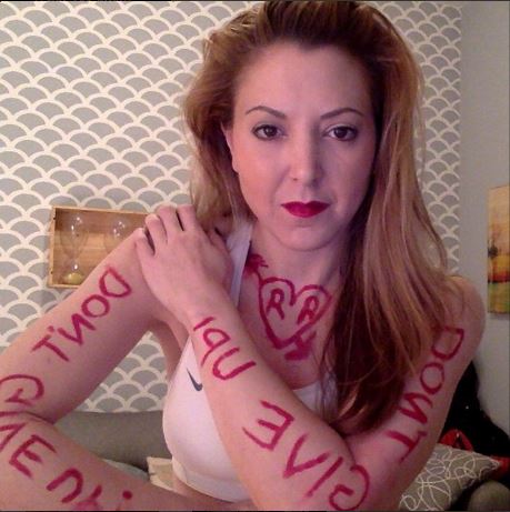
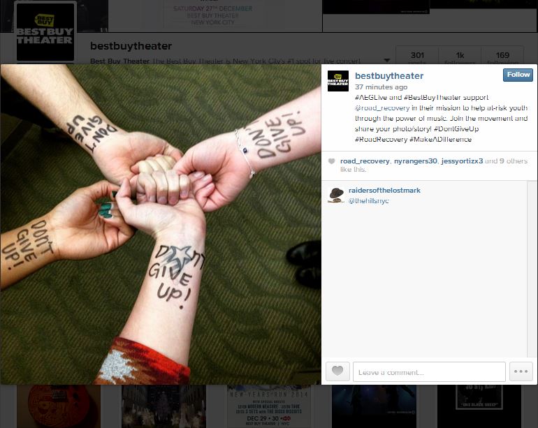
Strangers picked up Sharpies. Celebrities joined without being asked. A pregnant woman wrote it on her belly. Musicians, fans, families, recovery workers — people who had nothing in common except a quiet battle they were still fighting. The hashtag became a thread connecting thousands of private struggles into one very public act of solidarity.
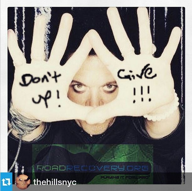
Slash of Guns N' Roses. Peter Frampton. Simon Kirke of Bad Company. Carlos Leon. The Wombats. Best Buy Theater and AEG Live through Road Recovery Foundation. None of it was paid. None of it was planned. It moved because the message was real and the world was ready for it.
The Build
As momentum grew, a logo was designed to give the movement a visual identity — something people could wear, share, and stand behind. That logo became a t-shirt line distributed through Bon Ton stores across the country, bringing the message into everyday spaces at national scale.
The campaign was partnered — not sold — to the Partnership for Drug-Free America and Road Recovery Foundation, allowing both organizations to benefit from proceeds while the intellectual property remained fully owned by its creator. Proof that creative ownership and social impact are not mutually exclusive.
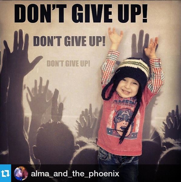
The Impact
What began as one person's act of creative conviction became a movement that transcended the addiction conversation entirely — inviting anyone in pain, at any stage of their journey, to feel seen. Major corporations brought the message into their stores. Nonprofits built programming around it. Celebrities amplified it without being asked. And the work endures as proof that the most powerful campaigns are the ones rooted in something true.
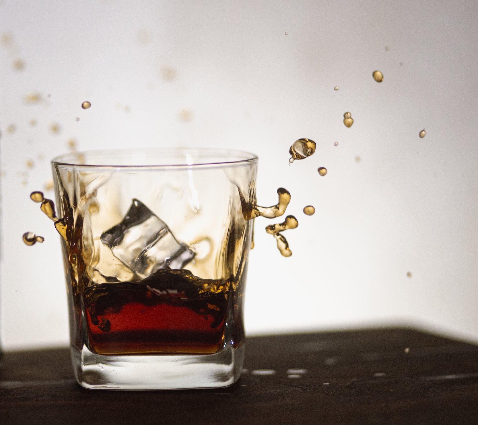
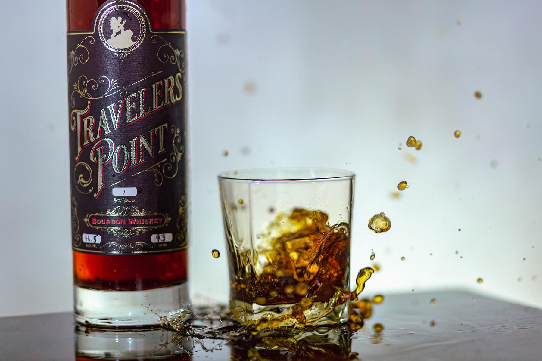
Full Brand Creation · Kirklin, Indiana · 2023
Director of Brand Strategy & Marketing Innovation
The Origin
Kirklin was named for Nathan Kirk — the first permanent settler in eastern Clinton County, whose cabin was the only stopping place for travelers and land hunters as far back as 1826. The name was always about passage, gathering, and beginning again.
When Master Distiller Mel Lytton, Dr. Chuck Dietzen, and the Mann Brothers came together to launch Travelers Point Distillery, they were doing exactly that — reviving a town, a tradition, and a trade that had been passed down through Mel's family since the 1880s.
The Man Behind the Bottle
Brick mason, blacksmith, woodworker, cattleman. A true renaissance man whose great grandfather started the distilling trade in the 1880s. Mel didn't just bring a product to market — he brought a lineage. That character had to live in every aspect of the brand.
"Life is too damn short to drink bad whiskey." — Mel Lytton
The Challenge
They didn't just want a new label. They wanted a brand worthy of the story. The challenge was not simply visual — it required strategic alignment between Mel's character, the town's deep history, the product, and a community-centered vision. The result had to feel rooted, intentional, and built to last beyond the bottle.
The Strategy
The brand was positioned not as a whiskey brand trying to be premium, but as a gathering place that happened to make exceptional whiskey. The vision: not just a distillery — a destination. A town-square gathering place where story, craft, and community converge around something worth savoring.
Every brand decision was run through that filter. Does it feel like a place worth traveling to? Does it honor the legacy without being trapped by it? Does it invite people in — not just whiskey drinkers, but community?
The Campaign
The "Whiskey in a Teacup" social campaign was built around the brand's core tension — something unexpected held in something familiar. The tagline "Discover the Power Within" extended Mel's own story outward, inviting the community to see themselves in the spirit of the place.
The campaign centered on a brand story film featuring Mel Lytton, bringing his voice and presence directly to the audience in a way that no label or logo could on its own.
The Outcome
The label design won an award — proof that strategic brand thinking and beautiful execution are not separate disciplines. The brand identity created a foundation strong enough to inspire community-centered expansion, with the distillery becoming a genuine gathering point for Kirklin and beyond.